Why Landing Pages Should Be Built Before Scaling Ads
Many businesses try to fix weak campaign results by increasing the budget.
They spend more.
They test more audiences.
They create more ads.
They push more traffic.
But if the landing page is not ready, more traffic will not solve the problem.
It will only expose it faster.
Paid ads can bring people to the page.
But the landing page decides whether that attention becomes action.
If the page is unclear, slow, confusing, or missing proof, the campaign may keep spending without generating strong results.
That is why landing pages should be built before scaling ads.
Traffic Is Not the Goal
Traffic is useful, but it is not the final goal.
A campaign may bring hundreds or thousands of visitors to a page, but if those visitors do not understand the offer or know what to do next, the traffic becomes wasted.
The goal is not only to get people to click.
The goal is to help the right people take the next step.
That next step could be:
Booking a call
Sending a message
Filling a form
Requesting a proposal
Buying a product
Downloading a guide
Starting a consultation
A landing page should be designed around that action.
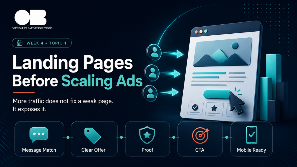
More Traffic Does Not Fix a Weak Page
If a landing page is already underperforming, sending more traffic to it usually makes the problem bigger.
A weak page can lose visitors because of:
Unclear headline
Weak offer
No proof
Poor mobile experience
Slow loading speed
Confusing layout
Hidden CTA
Too much information
Not enough explanation
Message mismatch between ad and page
In this case, the problem is not always the ad.
The problem may be what happens after the click.
Before scaling ads, the page must be ready to receive attention.
The Landing Page Continues the Campaign Message
When someone clicks an ad, they expect the landing page to continue the same conversation.
If the ad talks about one problem but the page talks generally about the company, the visitor may feel confused.
If the ad promotes a specific offer but the page shows many unrelated services, the visitor may lose focus.
If the creative feels premium but the page feels weak, trust drops.
A strong landing page should match the campaign message.
The headline, visuals, offer, proof, and CTA should all feel connected to the reason the person clicked.
Consistency builds trust.
Confusion creates drop-off.
The First Section Matters Most
The top section of the landing page is critical.
Visitors should quickly understand:
What is this offer?
Who is it for?
What problem does it solve?
Why should I keep reading?
What action can I take?
If the first section is vague, people may leave before seeing the rest of the page.
A strong landing page does not make people search for the value.
It makes the value obvious.
The headline should be clear.
The subheading should explain the benefit.
The CTA should be visible.
The visual should support the message.
Proof Makes the Page Stronger
A landing page should not only make promises.
It should give people reasons to believe.
Proof can include:
Client testimonials
Case studies
Reviews
Portfolio examples
Before-and-after results
Numbers or outcomes
Client logos
Process explanation
Certifications
Team experience
The more important the decision, the more proof the customer needs.
Without proof, people may like the offer but still hesitate.
Ads can create interest.
Proof helps turn interest into trust.
Mobile Experience Affects Conversion
Many people will visit the landing page from mobile.
If the mobile experience is weak, conversion will suffer.
A mobile-friendly landing page should have:
Readable text
Fast loading
Clear sections
Easy buttons
Simple forms
Visible CTA
No clutter
No broken layout
A page that looks good on desktop but feels difficult on mobile can lose leads quickly.
Before scaling ads, the page should be tested on mobile.
Not just viewed.
Tested.
Can the user understand the offer quickly?
Can they take action easily?
Can they submit the form without friction?
The CTA Should Be Clear
A landing page should guide people toward action.
If the CTA is unclear, hidden, or repeated inconsistently, visitors may not know what to do.
The CTA should match the offer and the customer’s stage.
For example:
Book a Free Consultation
Request a Marketing Audit
Get a Proposal
Send Us a Message
Start Your Strategy Session
Download the Guide
The CTA should feel like the logical next step.
A landing page should not leave people wondering what happens next.
Forms Should Be Simple
Lead generation pages often lose people at the form.
If the form is too long, too confusing, or asks for unnecessary information, people may leave.
A form should collect what is needed to start the conversation.
Not everything.
The more friction the form creates, the stronger the motivation needs to be.
For cold traffic, simpler forms usually perform better.
For high-ticket services, asking a few qualification questions can help, but the form should still feel easy to complete.
Reporting Should Connect Ads and Landing Pages
When campaign results are weak, brands often look only inside the ad account.
But landing page performance needs to be measured too.
Important metrics include:
Landing page views
Bounce rate
Time on page
Form submissions
CTA clicks
Conversion rate
Cost per lead
Qualified lead rate
Sales conversion rate
If many people click the ad but few take action, the landing page may be the problem.
Without landing page data, decisions become incomplete.
The Offbeat Approach
At Offbeat Creative Solutions, we do not look at ads separately from the page they send people to.
Before scaling campaigns, we review the landing page, message, offer, proof, CTA, mobile experience, and conversion path.
Because ads can bring attention.
But the page has to convert that attention.
A strong campaign needs a strong destination.
Final Thoughts
Before increasing ad spend, check the landing page.
More traffic does not fix a weak page.
It exposes it.
The landing page should continue the campaign message, explain the offer, build trust, guide action, and make the next step easy.
When the page is ready, ads have a better chance to perform.
When the page is weak, more budget may only create more wasted traffic.
Traffic starts the opportunity.
The landing page decides what happens next.