What Makes a Landing Page Convert
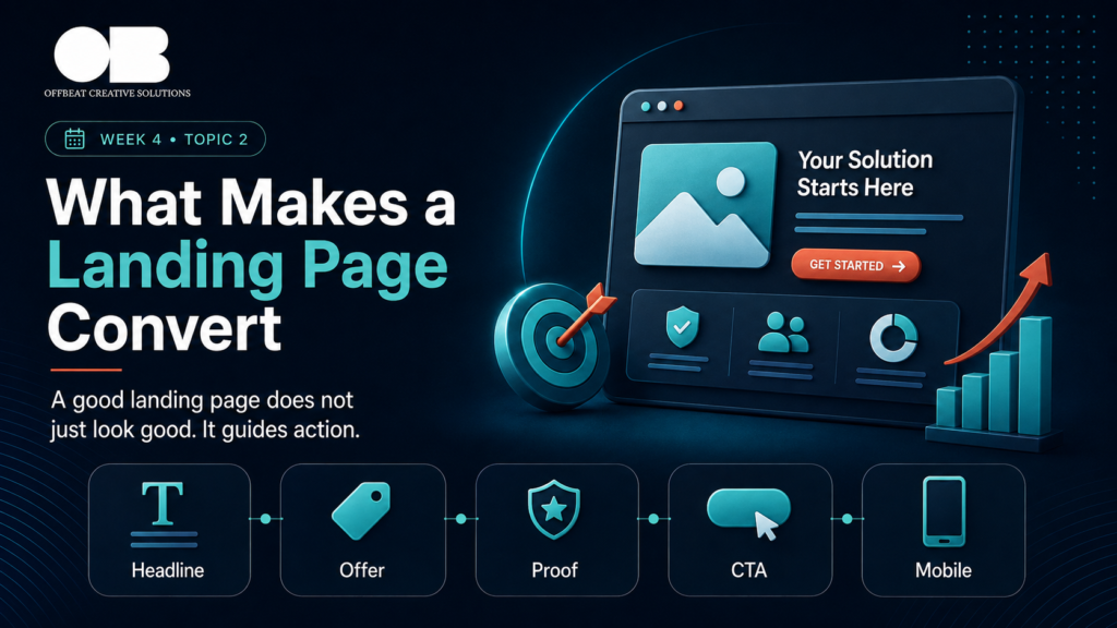
A good landing page does not just look good.
It guides action.
It helps visitors understand the offer, trust the brand, and take the next step with less confusion.
Many businesses think landing page performance depends mainly on design.
Design matters.
But design alone is not enough.
A landing page converts when every part of the page has a role.
The headline creates clarity.
The offer creates relevance.
The proof creates trust.
The structure creates flow.
The CTA creates action.
The page should not only impress visitors.
It should help them decide.
A Clear Headline
The headline is one of the most important parts of a landing page.
It is often the first thing visitors read.
A strong headline should quickly explain the main value.
It should not be too clever.
It should not be vague.
It should not sound like every competitor.
A weak headline may say:
“Grow Your Business With Us”
A stronger headline explains the offer more clearly:
“Build a Marketing System That Turns Traffic Into Qualified Leads”
The visitor should understand the value quickly.
If the headline is unclear, the rest of the page has to work harder.
A Strong Subheading
The subheading supports the headline.
It gives more context and explains why the offer matters.
A good subheading can answer:
Who is this for?
What problem does it solve?
What result does it support?
Why should the visitor keep reading?
The headline grabs attention.
The subheading creates understanding.
Together, they should make the visitor feel:
“This is relevant to me.”
A Clear Offer
A landing page cannot convert well if the offer is unclear.
Visitors need to understand what they are getting.
The page should answer:
What is being offered?
Who is it for?
What problem does it solve?
What outcome does it support?
What makes it different?
What happens after I take action?
If the page only lists services without explaining value, people may hesitate.
A clear offer makes the landing page easier to understand and easier to act on.
Strong Visual Hierarchy
Landing pages should be easy to scan.
Most visitors will not read every word from top to bottom.
They scan first.
Then they decide whether to read more.
Strong visual hierarchy helps guide the eye.
This includes:
Clear headings
Short sections
Readable text
Good spacing
Highlighted key points
Visible CTA buttons
Organized proof
Simple structure
The goal is to make the page feel easy.
If the visitor feels overwhelmed, they may leave.
Proof and Trust Signals
People need reasons to trust the brand.
A landing page should include proof that supports the offer.
This can include:
Testimonials
Reviews
Client logos
Case studies
Portfolio examples
Results
Certifications
Process breakdown
Team experience
Before-and-after examples
Proof reduces risk.
It tells the visitor:
Other people trusted this brand.
This brand knows what it is doing.
This offer is believable.
Without proof, the page may feel like a claim without support.
Objection Handling
Visitors may be interested but still unsure.
They may have questions or doubts.
A strong landing page addresses objections before they stop the visitor from taking action.
Common objections include:
Is this right for my business?
How does the process work?
Why should I trust this team?
Is this worth the cost?
What makes this different?
What results can I expect?
How long will it take?
These objections can be answered through sections, FAQs, proof, comparison points, or process explanation.
When objections are handled early, the visitor feels more confident.
A Simple CTA
The call to action should be clear and easy to find.
A landing page should not confuse people with too many different actions.
If the goal is to book a call, the CTA should lead to booking.
If the goal is to generate leads, the CTA should lead to a form.
If the goal is messages, the CTA should open a simple contact path.
Examples of clear CTAs:
Book a Consultation
Request an Audit
Get a Proposal
Start Your Marketing Diagnosis
Talk to Our Team
The CTA should feel direct, relevant, and connected to the offer.
A Smooth Mobile Experience
A landing page must work well on mobile.
Mobile visitors need a fast and simple experience.
The page should have:
Readable font size
Fast loading
Easy buttons
Short sections
No broken layout
Simple forms
Visible CTA
Clear spacing
If mobile users struggle, conversion drops.
A landing page is not ready until it works smoothly on the device people actually use.
Fast Loading Speed
Speed matters.
If the page takes too long to load, visitors may leave before seeing the offer.
This is especially important for paid traffic.
Every click costs money.
A slow page wastes budget.
Landing pages should avoid unnecessary heavy elements, oversized images, broken scripts, and cluttered layouts that affect loading.
A faster experience usually supports better conversion.
Message Match
The landing page should match the campaign that brings people there.
If someone clicks an ad about a specific service, the page should not send them to a general homepage.
If the ad focuses on a specific problem, the page should continue that message.
Message match reassures visitors that they are in the right place.
It also improves clarity.
A strong landing page feels like the next logical step after the ad.
The Offbeat Approach
At Offbeat Creative Solutions, we build landing pages as part of the full customer journey.
We do not focus only on visuals.
We focus on clarity, offer structure, trust signals, CTA, mobile experience, message match, and conversion flow.
Because a landing page should not only look professional.
It should help people understand, trust, and act.
Final Thoughts
A converting landing page is not built from design alone.
It is built from clarity.
It needs a strong headline, clear offer, trust signals, simple structure, visible CTA, mobile readiness, and message consistency.
The best landing pages make the decision easier.
They guide the visitor from interest to action.
Because a landing page should not just look good.
It should convert attention into results.