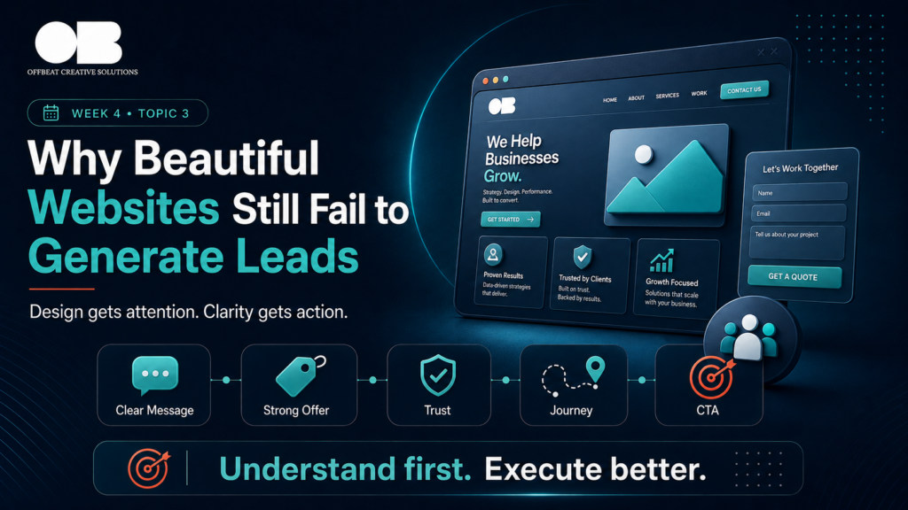
Why Beautiful Websites Still Fail to Generate Leads
A website can look beautiful and still fail to generate leads.
It can have modern design, smooth animations, nice colors, and strong visuals.
But if the website does not explain the offer clearly or guide visitors toward action, it may not support business growth.
Design gets attention.
But clarity gets action.
Many businesses invest in website design, then wonder why inquiries are still low.
The problem is not always how the website looks.
Sometimes the problem is what the website communicates.
Good Design Is Not the Same as Good Conversion
A good-looking website can create a positive first impression.
That matters.
But conversion depends on more than appearance.
A website needs to answer the visitor’s questions.
What does this business do?
Is this for me?
What problem does it solve?
Why should I trust it?
What makes it different?
What should I do next?
If the website does not answer these questions clearly, visitors may leave even if they like the design.
Beautiful design can attract attention.
But the message must turn that attention into action.
The Message Is Too Vague
Many websites use broad headlines that sound professional but do not explain enough.
Examples include:
“We create digital solutions.”
“We help your business grow.”
“Your success starts here.”
“Creative ideas for modern brands.”
These lines may look good on a homepage, but they do not always tell the visitor what the business actually offers.
A strong website message should be specific.
It should explain who the business helps, what problem it solves, and what value it creates.
If the message is vague, the visitor has to work harder to understand the brand.
Most visitors will not do that work.
They will leave.
The Offer Is Not Clear
A website should make the offer easy to understand.
If the services are listed but not explained, visitors may not know what to choose.
If the offer sounds like every competitor, the visitor may compare only by price.
If the value is hidden inside long paragraphs, people may miss it.
A clear offer should answer:
What is included?
Who is it for?
What outcome does it support?
Why does it matter?
What makes it different?
A beautiful website without a clear offer is like a well-designed store with confusing shelves.
People may enter.
But they may not buy.
The Website Has No Clear Journey
A website should guide visitors.
It should not simply display information.
The structure should move people from awareness to understanding to trust to action.
A strong website journey may include:
Clear homepage message
Service explanation
Proof and testimonials
Process section
Case studies
FAQ
Clear CTA
Contact or booking path
If the website has many sections but no flow, visitors may feel lost.
The page should lead people somewhere.
If it does not, the website becomes a brochure instead of a conversion tool.
There Is Not Enough Proof
People need proof before they trust a business.
A website that looks good but has no testimonials, case studies, reviews, portfolio examples, or results may not create enough confidence.
This is especially important for service businesses.
Visitors want to know:
Have you done this before?
Can I trust you?
Do other clients recommend you?
What kind of work do you produce?
What results have you created?
Proof makes the website more believable.
Without proof, the website may feel polished but unconvincing.
The CTA Is Weak or Hidden
A website should make the next step clear.
If visitors are interested, they should know what to do.
But many websites hide the CTA or use unclear buttons.
Examples of weak CTAs include:
Learn More
Submit
Click Here
Contact
These can work in some cases, but often they are not specific enough.
A stronger CTA tells the visitor what action they are taking.
Examples:
Book a Consultation
Request a Marketing Audit
Start Your Project
Get a Proposal
Talk to Our Team
If the CTA is hidden, vague, or too far down the page, leads may drop.
The Website Is Not Built for Mobile
A website may look great on desktop but fail on mobile.
If most visitors come from social media or ads, many of them will use mobile.
Mobile issues can include:
Small text
Crowded sections
Slow loading
Hard-to-click buttons
Broken layout
Long forms
Hidden CTAs
A weak mobile experience can damage conversion even if the desktop design looks perfect.
The Website Does Not Match the Campaign
If ads or social posts bring people to the website, the website should match the message they saw.
If the campaign talks about a specific problem but the website opens with a general company intro, visitors may feel disconnected.
This breaks the journey.
The website should continue the conversation started by the campaign.
That is how the experience feels smooth.
The Offbeat Approach
At Offbeat Creative Solutions, we believe websites should be more than beautiful.
They should be clear, strategic, and built around the customer journey.
We look at the message, offer, structure, proof, CTA, mobile experience, and conversion path.
Because a website should not only represent the brand.
It should help the brand generate action.
Final Thoughts
A beautiful website is not enough.
If the message is unclear, the offer is weak, the journey is confusing, or proof is missing, the website may fail to generate leads.
Design gets attention.
Clarity gets action.
A website should look good, but it should also explain, guide, reassure, and convert.
The goal is not only to impress visitors.
The goal is to help them understand why your brand is worth choosing.